Welcome to the Behind the Scenes area of Detailed, where I share the ins and outs of trying to create the most insightful SEO & profitable niche research reports on the planet.
In this blog post I’m going to take what is a pretty boring topic – header images you use on blog posts – and explain why I think it’s important I’ve tried to do something very different with mine.
More specifically, why I turned this:

Into this:

And if you get to the end, I’m going to explain what kind of header images I would use in lots of different niches so you have a better chance of your blog standing out online.
You might think the above graphic looks unprofessional and not at all something you could use on your own website. Especially not if you’re running a large, successful brand, like the 2,000+ that we track (that’s a homepage link).
That’s totally fine.
The most important thing to me is that it invokes some kind of reaction, and you don’t think it’s just a typical stock photo.
Why?
Because I’m blogging in the SEO space, where there are possibly more stock photos used on websites than any other niche.
Where hundreds (thousands?) of articles are pumped out daily discussing title tags, canonical tags, link building & keyword research.
I get just a few seconds to get a random strangers attention when they find our SEO angles or niche ideas via Google, and I want to give my content a better chance of getting read. Especially when I put so much work into my writing.
I think using stock photo reduces the chances of some people reading what I have to say, and it likely does in your niche as well.
Stock photo websites are literally filled with graphics tailored to people with a site in this space.
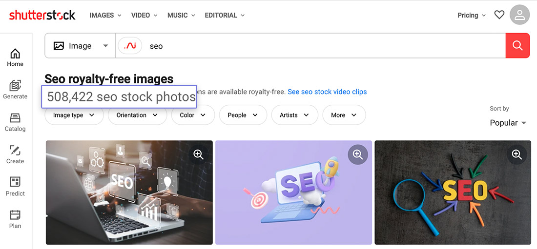
I don’t know how accurate search result numbers are, but that’s 500,000+ images tagged as ‘SEO’.
Here’s Something That Really Inspires Me While Trying to Build a Digital Empire (and I’m Glad I’m not Alone)
I’m not sure why this is exactly, but I’m super inspired by seeing office photos of successful, digital-first companies.
Brands that started purely online and yet have these amazing offices with tons of staff working from them.
I guess I just think it shows what is possible, as I have no desires of having a big team or impressive office space.
I know I’m not alone in liking these images as there are at least two websites dedicated to the topic. The one that I’m most familiar with is OfficeSnapshots.
Similarweb estimates it reaches over 250,000 people every month.
It has became so successful that they started an entire network of similar brands, with sites like Healthcare Snapshots and Education Snapshots.
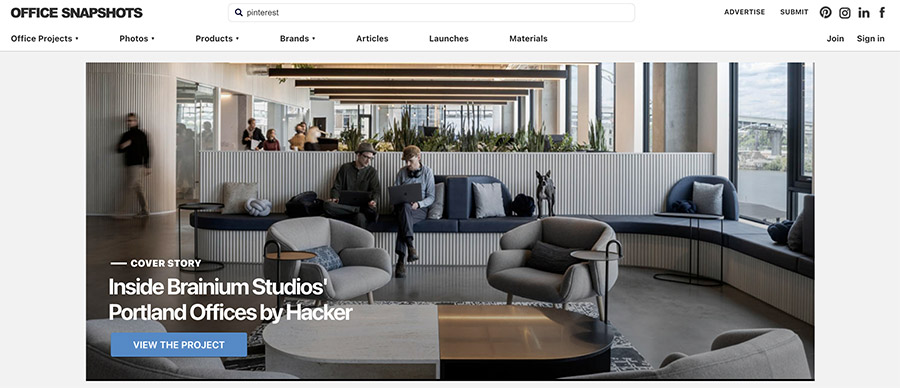
As this is an interest of mine and something I care about, I’m pretty lucky that lots of stock photo sites share images of exactly this.
I’ve purchased quite a few on Shutterstock already.
The “problem” is that they can still look like generic stock photos to anyone brand new to this website.
Enter the “little purple alien thing” which all started because of an emoji.
This one: 👾.
I’ve got all the details on that here.
The whole idea being, “Here’s an image that’s actually relevant to the topic (I use the Yext office photo when I talked about Yext in the article) and here’s my take on the topic.”
I’m not sure if that will come across when you keep seeing these over time, but at least they won’t be generic images.
And the worst case scenario is that only my daughter remains a fan.
Everything I’ve Just Written Above is Wrong
Just so we’re clear, I’m very aware that using stock images on blog posts would not stop my site being read.
I’m aware that unattractive, scraped-content websites can pull in millions of visitors per month from Google. I’ve even seen a few doing it without a logo. No joke.
I’m also aware that many of the biggest websites on the planet don’t think about blog post header images in any kind of detail.
If you read the homepage of this website (scroll past the opt-in form), the biggest digital first brands on the planet are exactly what I track.
Nerdwallet, a financial advice resource often touted as a blogging success story now that they’re a publicly traded company, don’t even use header images on most of their blog posts.
It’s definitely not a requirement for success.
My take is simply that I’m David battling Goliath online – and I know that most of my readers are in the same situation – so any opportunity I have to stand out should be taken.
Any opportunity to give brand new readers to this website a chance to give me a chance.
The SEO world is obviously not just people pumping out generic content. There are articles being published each month I wish I had written myself.
Semrush (the SEO tracking platform) have an active blog and they’re a publicly traded company who pulled in $188M in revenue last year.
They can easily afford the best designers and copywriters on the planet.
Ahrefs (a Semrush competitor) now do over $100M per year in revenue and they have some incredible designers on their team.
Those designers create custom illustrations for everything they write…

There’s a lot of websites that don’t even consider this kind of thing, but lots that think they’re important as well.
I’m in the latter camp, especially because it’s something I can control so easily.
Here’s How I Would Design Blog Header Images in Other Niches
To me, the images you use in a blog post header constitute an opportunity to inject Superpixels into your site.
If you don’t know what Superpixels are, I think you’ll like this Twitter thread of mine which went semi-viral.
In it I link to this (unlisted) video with some real world examples.
Again, the entire idea here is that whatever niche you’re in, you’re competing against brands with a lot of money and incredible metrics that can help them rank.
They can acquire their biggest SERP competitors and get incredible links from the resulting press.
They can run TV ads and direct people to their blog posts (Nerdwallet have done this).
And as I mentioned, they can hire the best people in the world in lots of different fields to help cement the position they already have.
The ideas I share are just one way to give you chance to stand out and build a brand in your space.
If you want to ignore this concept, that’s totally fine.
As I say, you can absolutely be successful without doing this.
But if you’re one of the few who see some value in this, let’s look at how this might apply to your niche.
If I had a food and cooking blog, I would get my brand logo etched into a cutting board and use that in our cooking process photos.
If I had a gaming blog, I would get my logo made into a neon sign and make sure its in the background of photos of me playing games.
If I was sharing tech and gadget reviews, I would definitely want to take my own photos of the products where possible, and learn a bit of Photoshop (or similar) so I could give them nice effects like blurred backgrounds.
If I had a garderning website and took original photos, I would get a little wooden version of my logo I could put in flower beds next to my plants.
I could go on here, but I think you get the idea.
Just do something a little bit more than your typical competition would.
A Few More Sources of Inspiration
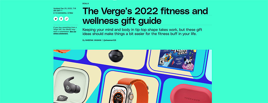
I think The Verge do a nice job with the header images. In their gift guides they show off all of the products they’re recommending, but display them in a stylish way:
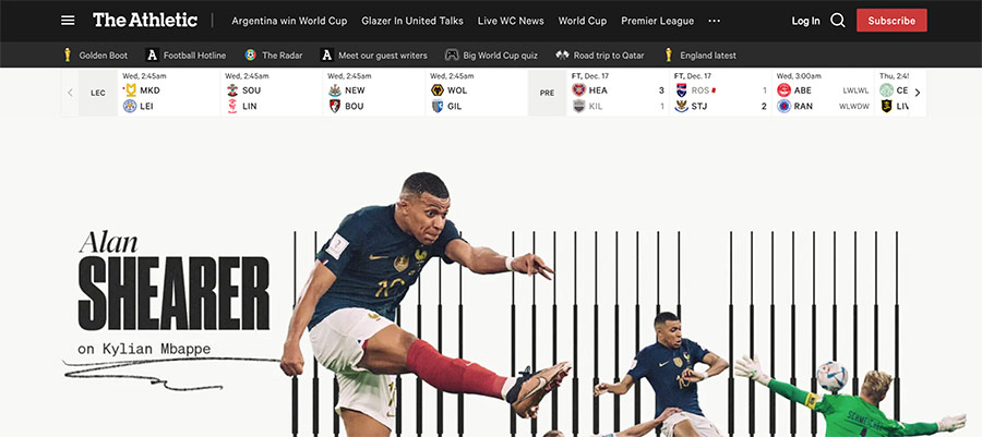
The NYTimes’ The Athletic don’t just show photos from a football game – which would be really easy to do – but add their own flair and styling to the majority of their graphics:
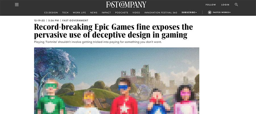
Fast Company are creative when it comes to designing images that match up with their story. Here the background is from one of the games they’re referring to, with blurred out children overlayed.
TechRadar like to ‘cut out’ an example of a product they’re talking about and then add their logo in the background:
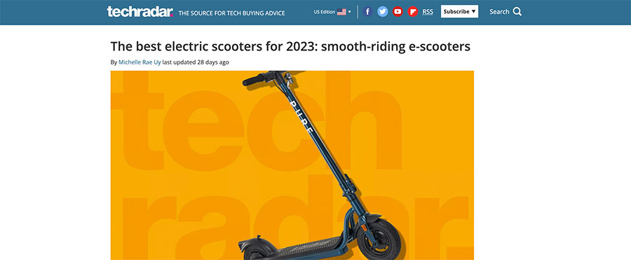
I don’t particularly love all of the styles that they put together, but at least they’re doing something original.
Anything you can do that helps you stand out even a little bit is worth it, in my opinion.
Once You Have the Concept, It Adds Nothing to Your Publishing Process
I can pick out office photos I like in a minute or two, and ask a designer I’ve chosen to craft the images for me.
If you get your logo etched into a cooking board for your recipes blog that I mentioned above, it’s a once-off expense and it adds no future time to your photo taking.
A neon sign of your logo for a gaming site is the same. A once-off time and expense commitment.
If you need help with custom graphics or illustrations, then I recommend checking out Fiverr or Upwork.
Here’s my personal 10 minute attempt at a 3D alien behind the Yext offices (image credit):

And here’s what a talented designer on Upwork can do in less than an hour:

Here’s another version outside Google’s offices that I thought was fun:

It’s really not any kind of hinderance to my usual operations to ask someone else to help me out with these graphics. I also love that I think it gives even more attention to the brands on the office photos in question.
Now Let’s Talk About Price, Because You Publish More Often Than 1-2x Per Month
If my plans come to fruition, I’ll publish anywhere from 10-25 blog posts on Detailed in 2023.
That’s actually a huge jump for me since I’ve only written about 12 in the history of this entire website (hopefully you can see I try to focus on quality, rather than quantity).
Compared to what you’re doing though that number is potentially very small. I assume most people reading this are publishing content at least weekly, if not a few times per week.
Someone reading this is publishing multiple articles per day.
You aren’t going to get the benefit from customising so many images in the way that I’ve shared above. And you’re very unlikely to see the financial return from it.
Let’s start with my own numbers.
A single photo on Shutterstock costs me $4.90 on their monthly plan, or $2.90 if I pay for a year upfront.
Those costs drop quite a bit further if I want more images. If you want 50 images per month, that’s $1.98 each.
That’s reasonable even if you’re publishing a lot of content.
To customise the main graphic in this post that I’ve already shared twice (the Yext building) cost me $35 on Upwork.
The following graphic with the ‘little purple alien’ on Semrush’s NYSE listing day cost me $12.50.

While I think the first image is better, making the second image look realistic was much harder in my opinion.
The reason for the price difference is pretty simple though: I hired 6 different people.
I gave everyone a different angle and picked what I liked the best. Some people didn’t do a great job, which is why I’m happy I went through this process.
As these were my first images with each designer I’m sure I could get the prices down if I commited to some kind of long-term agreement, but I’m more than happy with these prices.
(In fact, I actually felt bad paying just $12 for one graphic).
It’s hard to give specific advice for your situation as I don’t know how much content you’re publishing and how much money you’re making from that content.
The more money you’re making, the more you’re fine with higher design costs (and potentially even hiring someone full-time).
With that in mind, I’ll make a few generic points:
1. If you’re publishing too much content to customise all images, at least customise those that attract the most links and / or visitors.
2. Keep in mind what I said in the last section about just adding something to your current process. E.g If you’re taking photos of the recipes you make, getting your logo etched into a cutting board is once-off and something you can use for years.
3. If it makes sense, play around with Photoshop filters (or other app filters) or get to grips with tools like Canva so you can at least give your images some form of customisation.
4. There are talented people available for less than you think on Fiverr, Upwork, Freelancer and more that you can use for inspiration.
I think this stuff matters, and that’s why I give it my attention.
Some people are going to love this post and others are going to think I’m stupid for thinking about this so much.
Whatever the case may be, I’ll keep sharing my thought process and what I’m working on in this ‘Behind the Scenes’ blog in the hope I can help you improve some aspect of what you’re working on. Cool?
I never thought I would have 2,000+ words to say about the header images that go on a blog, but I think I’ve covered pretty much everything.
I know this was a weird topic, but I’m just here to share my processes and hopefully try and help you get better results as well.
I appreciate you being here.
P.S. Interested in more behind the scenes content? You can find it here.







 If we want to share the best niche ideas & SEO insights online - especially when we're up against companies listed on the stock market - we have to do things differently.


