


 If we want to share the best niche ideas & SEO insights online - especially when we're up against companies listed on the stock market - we have to do things differently.
In this behind the scenes section of our website, we thought we would share the ins and outs of how we're doing exactly that, with the aim to give you ideas on what to do for your own online projects as well.
There's a good chance that some of these will be password protected or at least noindexed (not findable via Google) but we'll link up the footer properly soon.
Leave me a message on Twitter (@viperchill) or reply to our newsletter emails to let me know what you think of these. All feedback is appreciated!
Did you know that some of the biggest companies on the internet spend thousands of dollars on the fonts they show on their website?
Or that Saas companies like Ahrefs even get their own created?
Or that…I paid hundreds of dollars for a single font on this page because I saw it being used on the blog of one of the world’s biggest payment providers?
I’m going to go into detail on the exact fonts I use and where.
This page is password protected, but it’s completely free to read.
To unlock the page – and all protected posts in our ‘Behind the scenes’ section – simply reply to any issue of our newsletter (you can sign-up free on our homepage, here).
Tell me you want the password and I’ll reply with it in less than 24 hours. It’s completely free.
One password will unlock all current and future protected posts, so you never have to do this again. 🔓
I Think Font Decisions Matter Massively
I absolutely love the fonts in place on this website and I’ve seen them being used by some brands that really care about design.
You’re welcome to disagree – everyone has different tastes – but there’s something I think we can both agree on: The second example image below looks way better than the first.
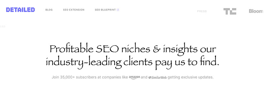
I admit I went with a bit of an extreme example for the first image, but this should be a clear example that the font you use on a website can give it an entirely different niche and era feeling.
That feeling is the reason I care about them so much.
Let’s dive into the actual fonts that I use…
Font #1: Gulkave-Regular
Font price: $11.95.
Gulkave is the font that we use for the Detailed logo.
Though I’m quite proud of some of my design decisions for this website, I don’t think our logo is particularly special.
I really just wanted something simple and text-based. I like that it has a slight 8-bit, retro style. Especially in combination with a more modern-looking website.
The font costs $11.95 at the time of writing, via MyFonts.com.
I could have made the logo an actual image, but as I am using it as a web font I can type it out, like this: DETAILED.
- Then I can change the color: DETAILED
- I can change the letter-spacing: DETAILED
- I can change the size: DETAILED
And so on.
I’ll end this section by saying that if this font is used with lowercase letters I think it looks pretty awful.
It would look even worse if I didn’t smooth those letters with CSS as well.
Font #2: Söhne Mono Buch
FONT PRICE: Read below or you’ll think I’m crazy.
Monotype fonts tend to be a bit more robotic, and help break up two separate areas of text.
I like using older style, more structured fonts next to smooth, modern ones to help contrast them.
I much prefer this font when it’s written in all-caps, rather than lowercase.
Here it is in action on Detailed:
Example #1: Here it is without any kind of editing
Example #2: HERE IT IS IN UPPERCASE
Example #3: HERE IT IS IN UPPERCASE AND FONT SMOOTHING
Example #4: HERE IT IS IN UPPERCASE, WITH FONT SMOOTHING AND LETTER SPACING
The first version is my least favourite, with the final version being my favourite.
I actually wouldn’t use this font in the style of examples #1-3 whatsoever.
I’m only writing this sentence because bold and highlighted sentences next to each other is too much noise competing for your attention, but let’s talk numbers…
This font cost me $210 for lifetime usage on Detailed, but will actually go up in price if I start getting a lot more pageviews.
Yes, you read that right.
Many font licenses for the web are based on how many times they are seen.
You might also think I’m crazy for paying so much for a font (especially if you don’t like how it looks).
I didn’t say I’m here to convince you to do the same thing – I have free alternatives later for a reason – just that this blog will share the behind the scenes insights on what I’m doing here at Detailed.
I personally love this font (of course) and I’m definitely not their first customer.
The company who made it, Klim, probably have their fonts used somewhere in your local area.
They even created many of the fonts that Paypal uses in their app and on their website.
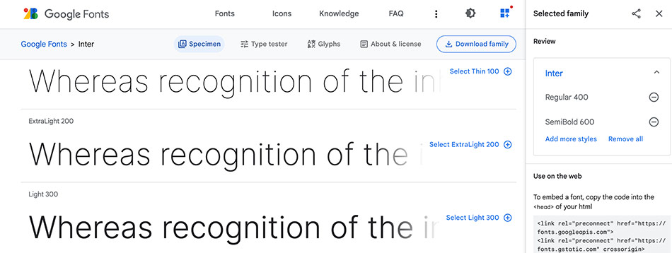
Font #3: Inter
FONT PRICE: FREE
My ‘body copy’ font – or the font you’re reading right now – is Inter.
It’s available free on Google Fonts.
It’s simple and clean, and comes in lots of different weights (I promise that’s the correct terminology).
Even incredible designers say so:
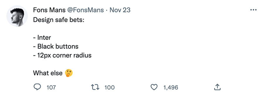
Safe or not, I choose Inter because it’s easy to read and I like how it looks.
Being free is just a bonus.
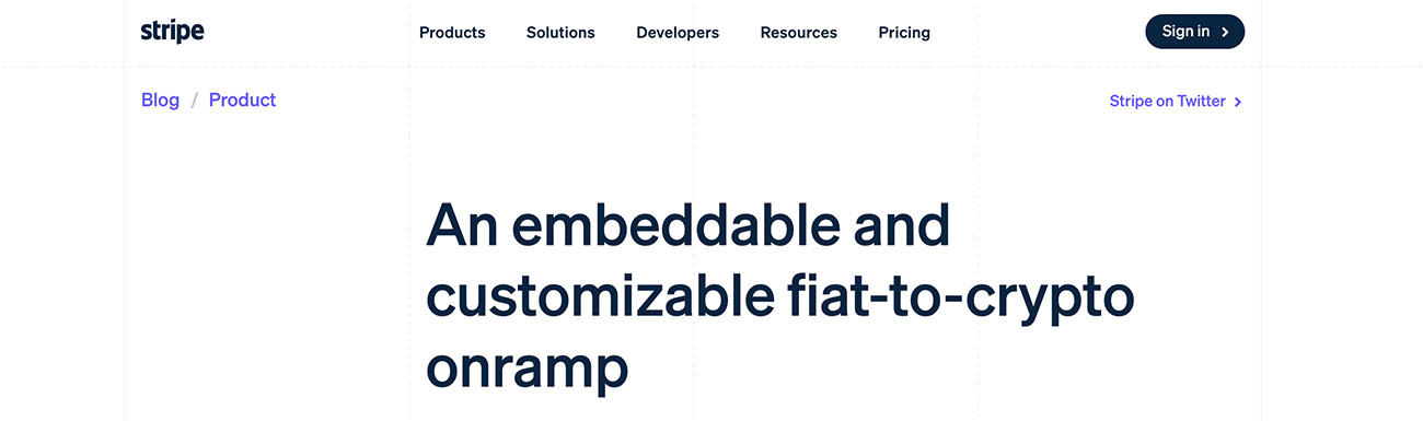
Font #4: Söhne Halbfett
Font price: $210
This font in question is the one you see in every headline on this website.
It’s the font that says Font #4: Söhne Halbfett just a couple of lines above.
It’s the font I fell in love with after seeing it in action on the blog of Stripe, the multi-billion dollar per year payment processor that you’ve likely given your credit card details before.
I would have purchased it at $500 (and might have to if Detailed ever starts breaking traffic records — see font #2 for an explanation).
While the copy behind a headline is far more than the font that frames it, they are so prominent on this website that I wanted something I thought looks great.
I really like how the Stripe blog looks and their headline font is definitely a part of that.
Free Alternatives I Still Think Look Great
I’m not opposed to using free fonts if they look good.
In fact, I would obviously rather fonts were free if they are what I’m looking for. It just happens that two fonts I fell in love with happened to have a bigger than expected price tag.
With that in mind, over the years I’ve came across a number of free fonts I think look great.
I’ve already shared that I like Inter for body copy, which is free.
Free headline Font: Manrope
Manrope, from Google Fonts, actually used to be the headline font here on Detailed before I purchased the font I’m using now.
I still think it looks great…
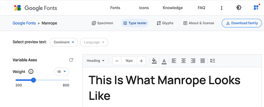
I don’t particularly like it at low font weights, but 700,800 or 900 look modern and confident to me.
Free / Cheap Body Copy & Headline Font: Proxima Nova
I’ll start by saying that I’m a little bit confused by this one, as my understanding is that Proxima Nova has always been a free font.
It’s available for free on a number of sites as a desktop font, though doing more research appears that this is for personal (non-commercial) use only.
However, it also available for sale on MyFonts (single style) for $15 as part of Adobe Fonts, which is a monthly paid service.
I have decided to include it here because I think it looks great as both a headline and body copy font, as you can see below.
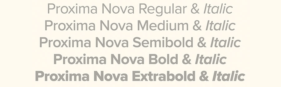
If you are going to use this on your websites then a single style goes for around $15 on MyFonts, which I think is more than worth it (it’s better to be safe).
Free Subheading Font: Roboto
Even though I have access to a lot of premium fonts, Roboto still finds its way into a number of presentations that I make.
I actually think it works pretty well as a body copy font as well, but I tend to use it for sub-headings as it’s a bit on the lighter (thinner) side.
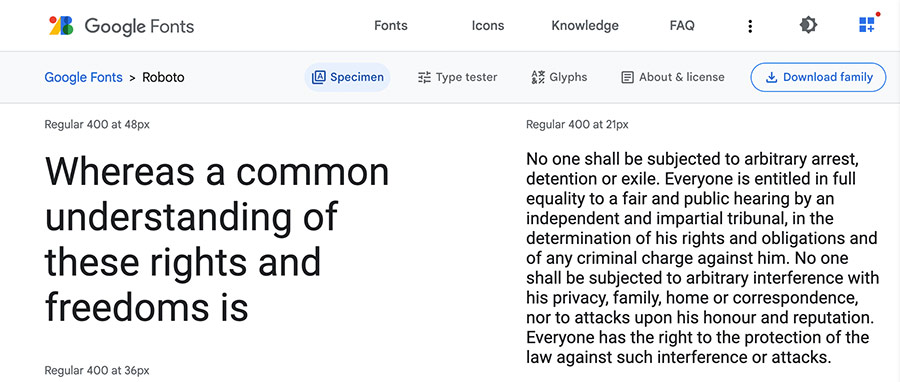
You can find it on Google Fonts over here.
Three Tips to Improve Fonts on Your Website
#1. Try Font Smoothing in Your CSS
I don’t add this to every font, but I add it to most. Add this to the CSS for the piece of text you’re looking to style:
-webkit-font-smoothing:antialiased;
It’s a very subtle change, but tends to make fonts look better (especially on a Mac device).
#2. iPhones Generally Don’t Like the Wrong Font Weight
You can generally get away with using the wrong ‘weight’ for a font on a desktop device, but it tends to make fonts look awful on an iPhone.
When you purchase or download a font, you’ll see that it comes with a specific weight. Roboto for example, mentioned above, was originally designed to be used at ‘400’ weight, but bolder options are available.
If you don’t write “font-weight:400;” in your CSS, then it probably won’t look great on an iPhone.
#3. Most of The Time, You Can Easily Spy on What Font Someone Is Using
If you have the technical knowhow you can even find fonts that people try to hide, but it’s very rare that websites try to hide them.
The reason I was able to get the same headline font as the Stripe Blog is because I inspected it in Google Chrome.
Simply Right > Click on any font you’re interested in knowing about and select Inspect.
Then look up the font family like I have in the graphic below:
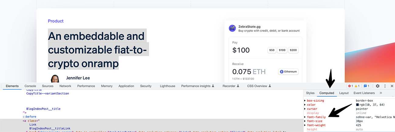
You can use this pretty much anywhere around the web to see what other sites are using.
I think that’s everything.
I hope you found this insightful!