Future today announced the redesign of TechRadar, one of the web’s biggest authority sites covering technology news and product reviews.
Future (trading publicy as $FUTR) are currently the biggest digital goliath we track in terms of how many brands they operate, with their 86 sites pulling in more than 100M clicks from Google each month.
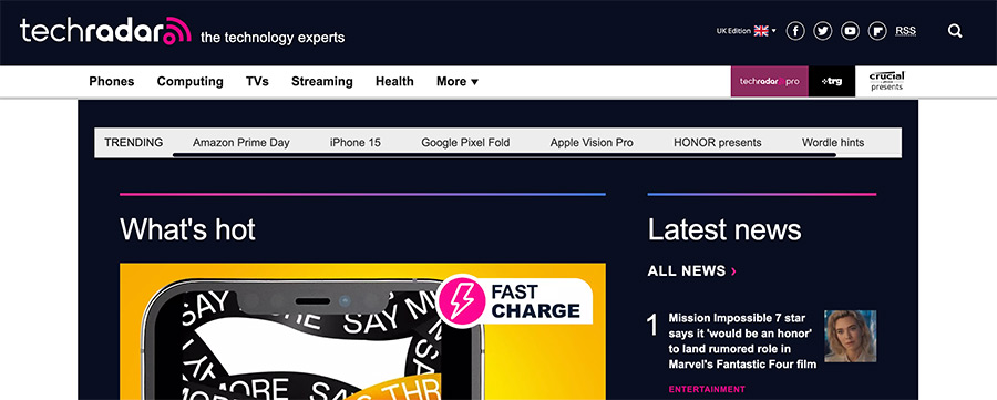
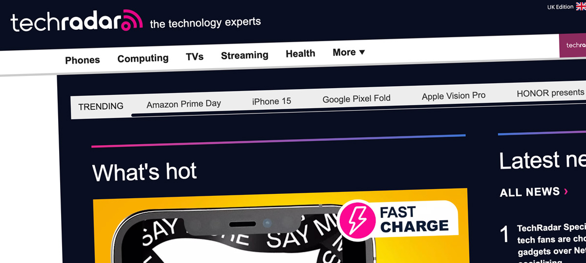
Black and pink is the new colour scheme they’re going for, compared to the muted blue of their “previous” design. I put previous in quotes as you can still access their old design if you look at any international versions of the site.

When I saw the announcement I clicked through expecting some futuristic looking rebrand the likes of ZDNet and The Verge have debuted in recent times.
I’ll try not to be too critical here as design is a very subjective thing and I’m sure they know what they’re doing, but it almost looks a little bit dated to me.
My context being that this is one of the biggest sites from one of the biggest digital goliath’s on the planet, receiving an estimated 24.5M visits each month according to Similarweb data. I thought they would have tried to push the boundaries a little more.
Still, I will give them credit in that it’s clean and easy to follow.
I couldn’t help but notice they’ve highlighted some elements they clearly think are important for the next few years of the site competing in a saturated vertical.
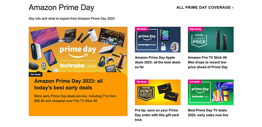
Articles around current shopping events are found just after their latest posts on the homepage:

I can imagine that when Black Friday and Cyber Monday come around this area will be used to accommodate those posts, as could something like Google’s annual IO event.
That said, I’m not sure what they’ll be used for when an event like that isn’t happening. I’ll check back in a week and see.
The different product categories they review are the next big call to action:

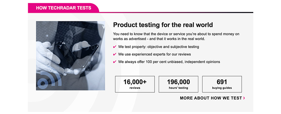
Then there’s the social proof of why you should trust their reviewers and click on their affiliate links when they give product recommendations. They clearly think this social proof is important, and I do too.
I’ve advised other sites do something similar on numerous occasions and throughout SEO Blueprint.

Finally, there are not one but two separate callouts regarding who is behind the site and how much experience they have in the space.

Of course, these separate sections are all interspersed with different news and udpates coming out of companies like Apple, Samsung & Sony.
The UK Editor-in-Chief of TechRadar, Marc McLaren, said of the redesign:
The new TechRadar is all about helping our readers buy, use and enjoy the best technology, so we needed a website that works just as seamlessly to take them where they needed to go.
It’s clear this isn’t just PR speak and actually something they’ve attempted to do.
As far as I can tell, all of their main changes were focused around the homepage and category pages. While individual posts are now topped with their new black and pink navigation bar, they didn’t change individual post width or structure.
Hopefully you can see from my own websites I care about the finer details of web design and think it’s an important factor in the success of how well a brand does online.
There’s nothing mind-blowing about this redesign, but they’ve perhaps given further confirmation that highlighting in some way why readers should trust you is going to be increasingly important going forward.


